TAFE Typography: Branding
Design Brief
Design a brand for a delivery company.
Design Solution
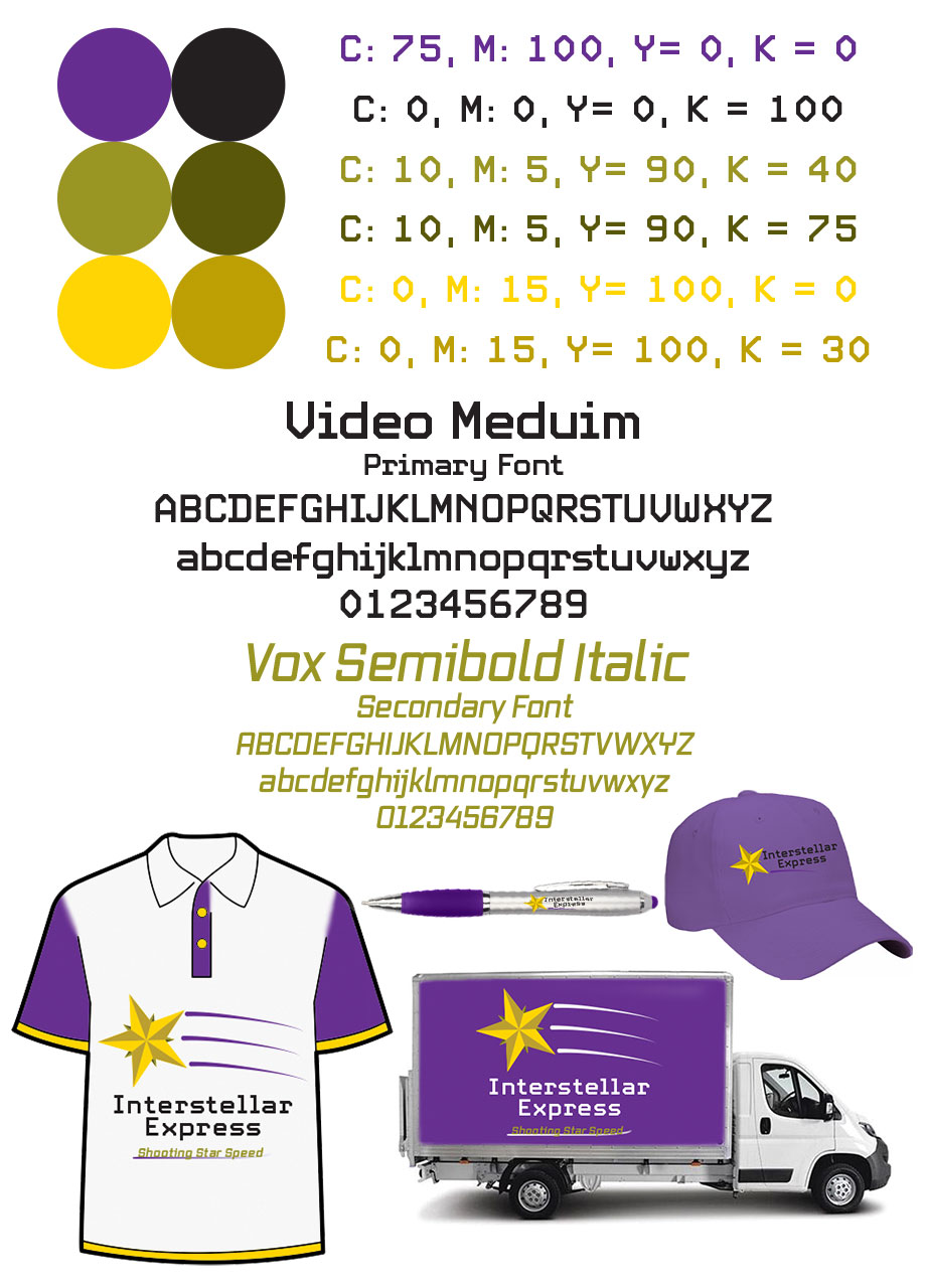
The first logo was Interstellar Express, one of the names we could choose from in the brief. I chose to use a shooting star, with purple and yellow being the main colours. The star was given extra depth with the splits. The trails make it look like a shooting star, informing the tagline.
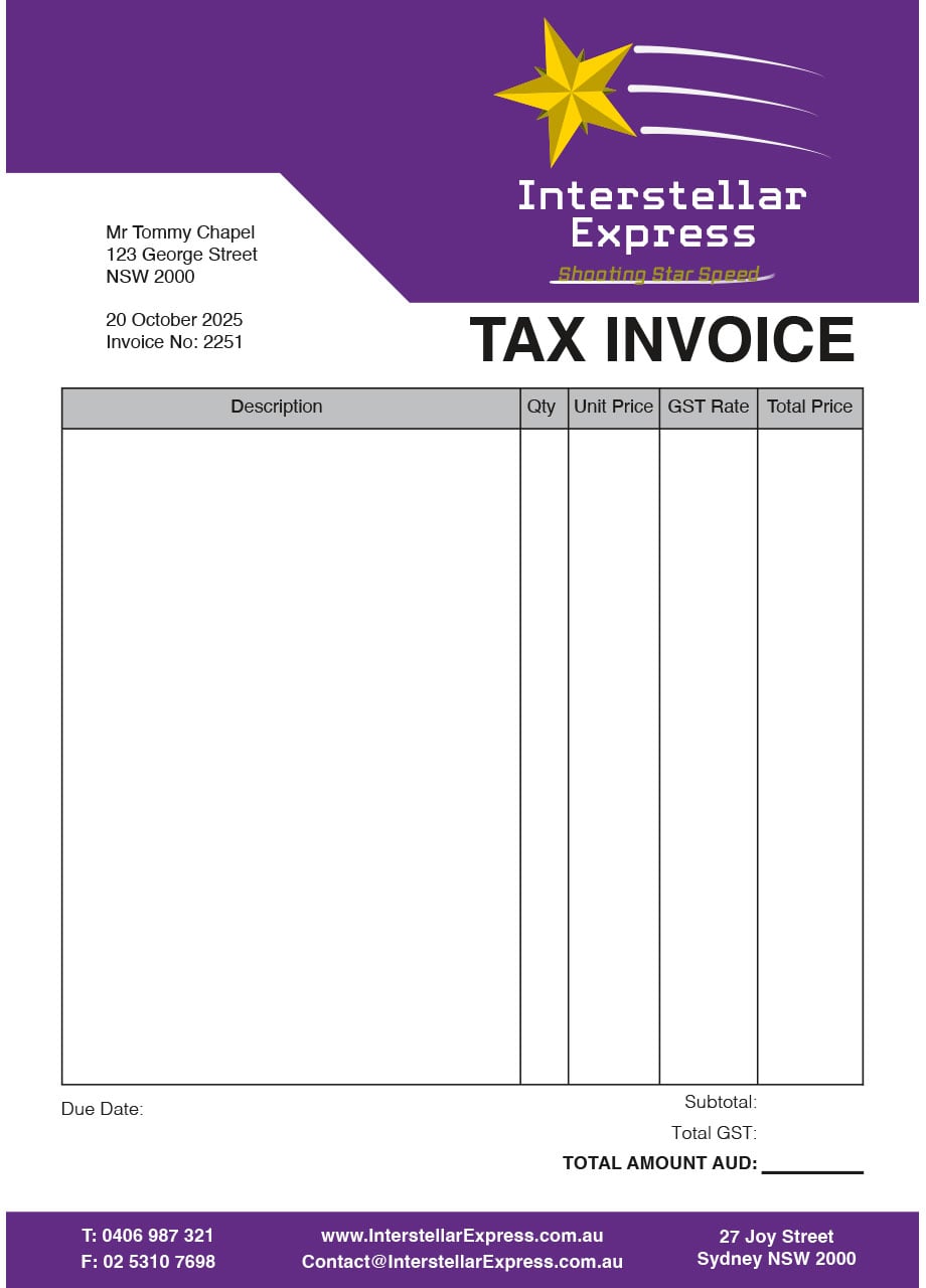
The main colour for many objects was purple, so those streaks became white to still be visible. The invoice’s top was indented to showcase the logo, but still have room for the recipient’s information. The employee shirt was custom coloured in Adobe Photoshop to showcase the main colours subtly instead of an ‘in your face’ splash of purple/yellow.