TAFE Packaging: Alerion
Design Brief
Design a brand and box
design for three types
of alergy medication.
Design Solution
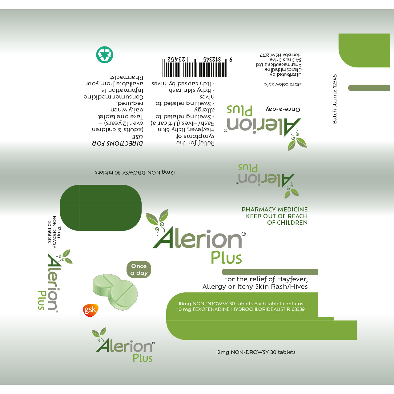
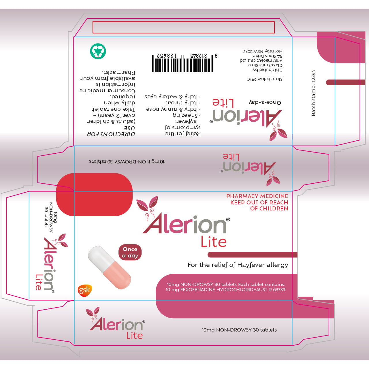
The first part of the design process was the logo, going through different designs, like the hole in the P being a plus sign for the ‘Plus’, and the ‘Kids’ section being bubbly. One thing that was kept was the way the A in ‘Alerion’ was stylized. The logomark was designed to showcase leaves blowing through the wind, to represent alergies.
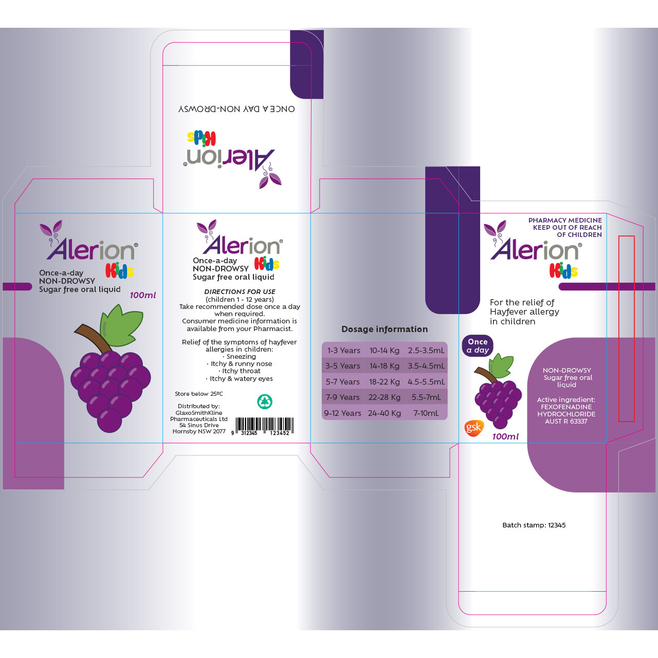
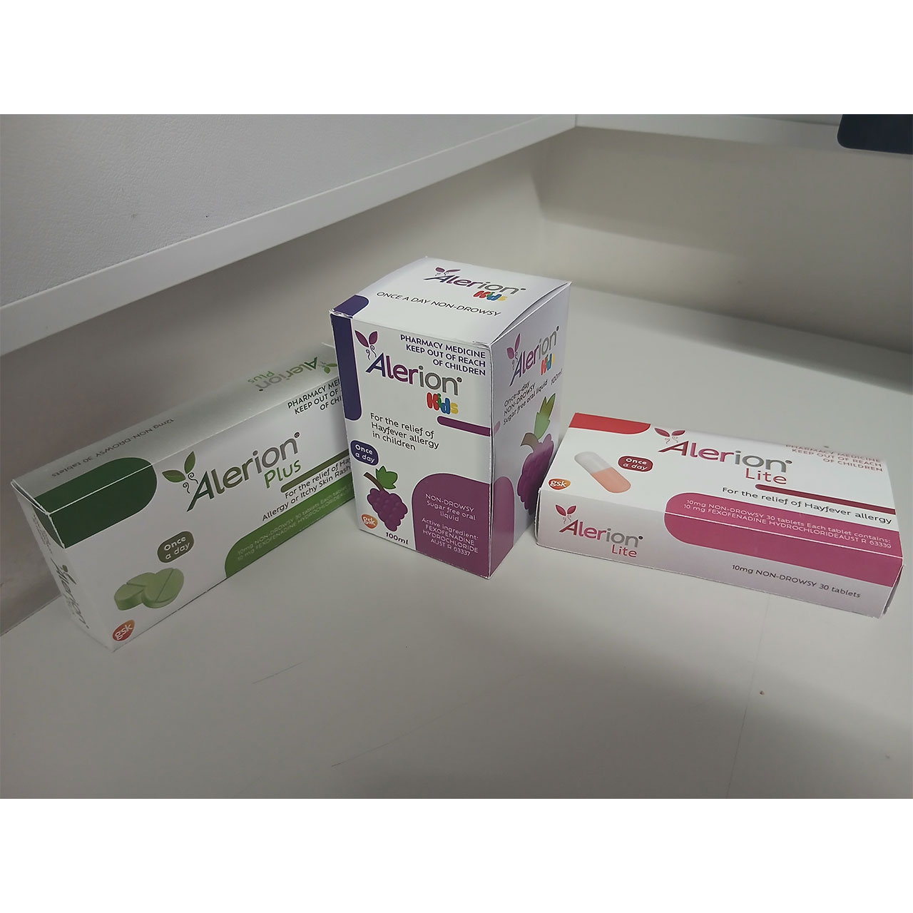
The layouts of the boxes were made through three different designs for the two types. The chosen design style was one of smooth rounded shapes that overlap the corners and stretch out.
All the information on the boxes was provided by the client, along with the barcode and non-Alerion logos. The tablet and pill icons were also provided, with colour edits to match
the themes of the box.
Each box was given a colour theme, and with the Kids box, its colour denotes its flavour, grape. A vector drawing of a grape was created to showcase this, and a colour thematic dosage information.